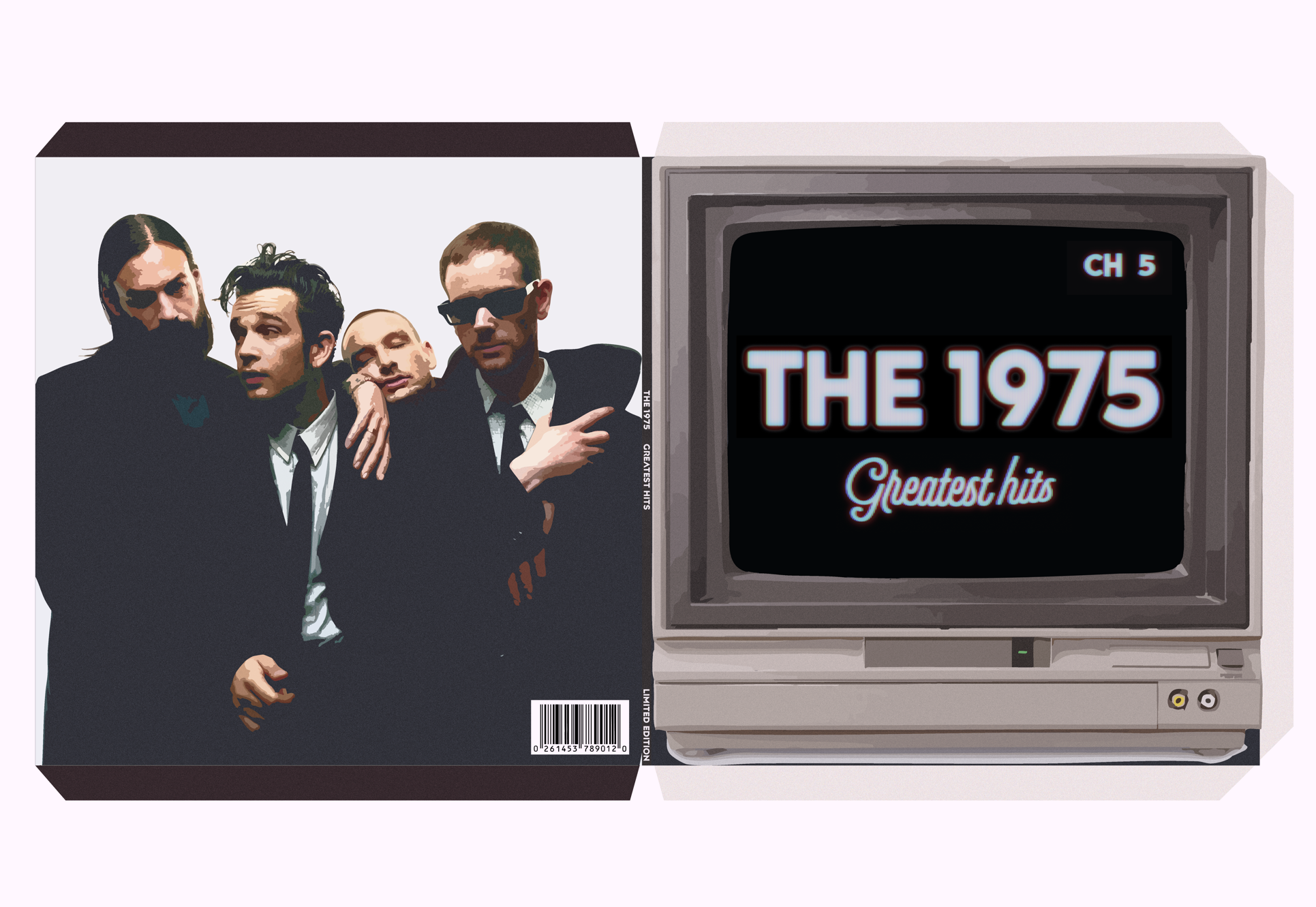
This project reimagines a Greatest Hits vinyl release for The 1975, translating the band’s evolving visual identity into a cohesive physical album experience. The goal was to design a vinyl package that feels both nostalgic and contemporary—mirroring the band’s relationship with media, performance, and cultural memory. The design draws heavily on themes of broadcast, repetition, and nostalgia, referencing analog television, live performance, and the band’s long-standing use of framing as a visual motif. The television imagery represents the idea of “greatest hits” as moments replayed and consumed over time, while the clean geometric frame nods to The 1975’s iconic visual language.
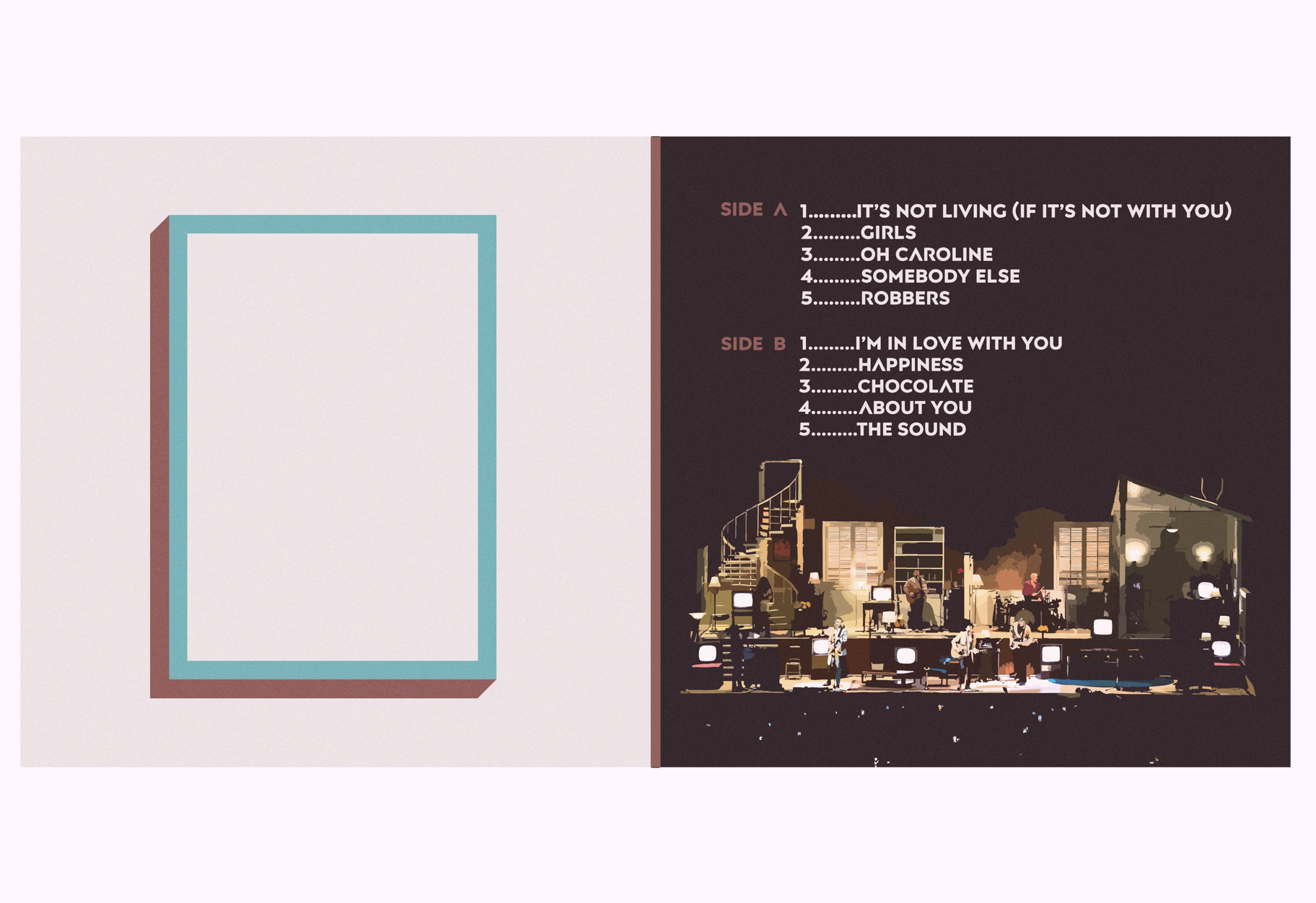
This contrast between analog texture and minimal structure reflects the band’s blend of emotional vulnerability and polished production. Typography is intentionally restrained, prioritizing clarity and hierarchy. The muted color palette—soft neutrals contrasted with deep, dark tones—supports the nostalgic tone while keeping the design modern and timeless. The final vinyl package presents a cohesive system rather than a single image, showing how brand identity, storytelling, and physical media design can work together. The project demonstrates my ability to translate an artist’s existing visual language into a new format while maintaining conceptual depth, consistency, and strong visual hierarchy.